Guests cannot access this course. Please log in.
6.2 Applied data visualisation
Completion requirements

Make forum posts: 1
Let's examine the basic principles of data visualisation.end-activity-description
120end-activity-time
Purpose
The aim of this section is to help you identify effective ways to communicate data insights.
Activity instructions
First, consider the language you will use to describe effective visualisation. Second, consider the bar graph and answer the questions that follow.
What words do we associate with effective visualisation?
Please take about 10 minutes to examine the graph below and answer the following questions:
- Take notes on the key findings from your perspective (list at least two points).
- Consider: Is this a good graph? Is it easy to interpret?
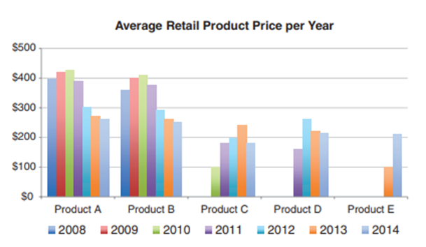
We can observe that Product A and B’s prices are at peak in 2010; however, from 2011 the price starts to decrease. In addition, Product E may launch in 2013, since there is no price for Product E from 2008 to 2012.
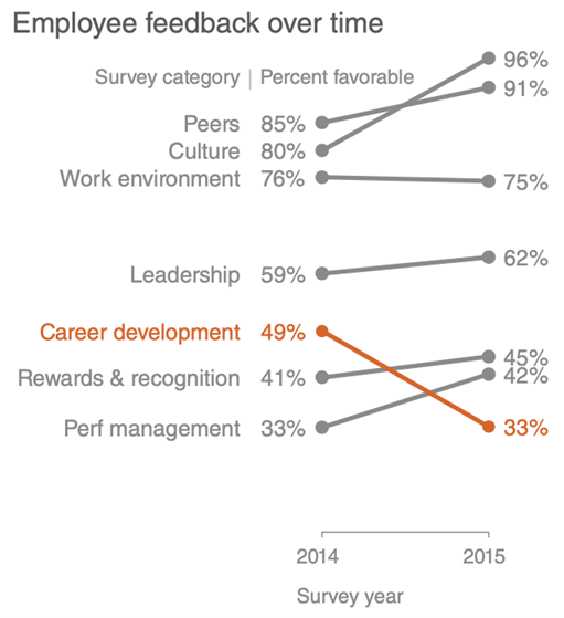
While we can observe the above information from the graph, it is a bit hard to interpret it. Many people think that this graph is the end of the data visualisation process, but this is not the case. Good visualisation needs to tell a story about our data. However, data visualisation tools, such as Excel and Tableau will not know what that story is. That’s where you — the data analyst — come in. You need to tell the story visually to the decision-makers. Please see the next graph for an example of storytelling with data.
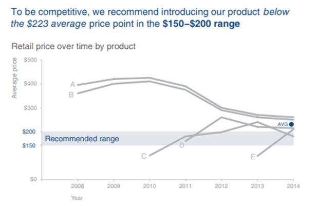
The above graph has the following advantages:
- It shows retail price trend over time for different products.
- It highlights the recommended range of the average price.
- It has a short sentence summary at the top to help the audience quickly grasp the point.
A step-by-step guide to good data visualisation
As shown in the graph below, there are 4 steps to guide producing a good visualisation.
Three things to avoid in visualisation
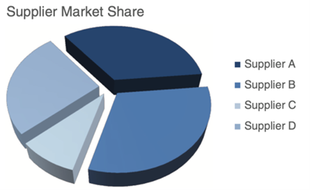
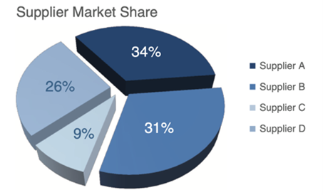
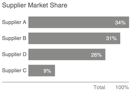
It might have surprised you not to see a pie chart in the last activity. Let's have a look at the example below. The graph on the left-hand side does not have additional numbers (e.g. a percentage). Thus, it is hard to tell which supplier holds the biggest market share. While the middle graph includes percentage, it is not really useful to distinguish between the two biggest suppliers. If you recall, one of the key measures we previously mentioned to ensure comparability is to anchor your visualisation at a basis. This means we cannot do this in a pie chart. Therefore, the bar chart on the right-hand side is the better option to clearly communicate who owns the highest market share market.
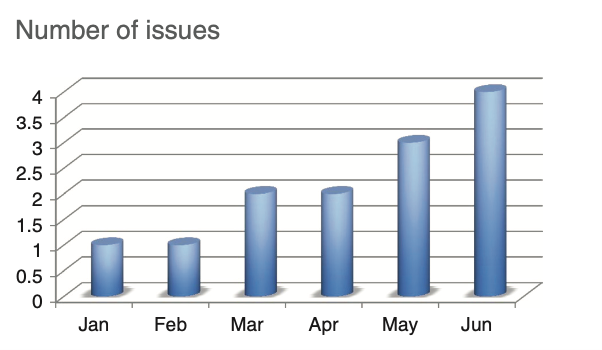
The graph below visualises the number of product issues reported by customers per month. There are two dimensions: the number of product issues reported and the month. However, this graph uses three dimensions of visualisation. As a result, it is harder to compare the information for January and February, and for March and April than it would be if using a two dimensional graph. Thus, we need to avoid adding more dimensions than we need.
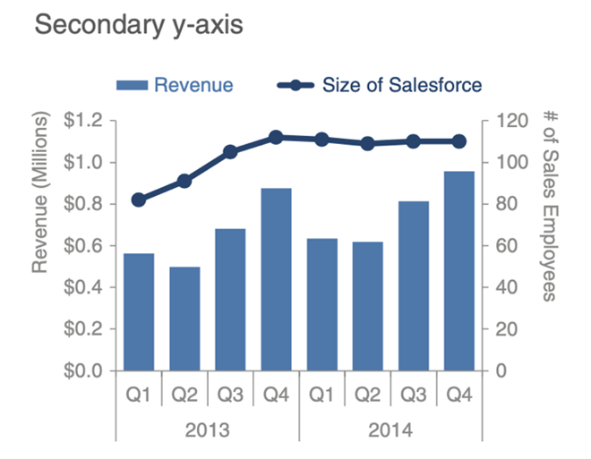
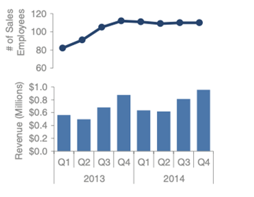
Another thing to avoid is the use of a second y-axis in order to present two graphs in one. As presented in the graph on the left-hand side below, a bigger sales force is justified because it comes with bigger revenues. But the graph requires you to understand which data should be read against which axis. To make it easier for the audience to derive the information, we can pull the two graphs apart and stack them one on top of the other (see the graph on the right-hand side).
Discuss
In step 2, we learned about the different types of graphs. Now please select one form and think about how to apply the graph in your communication. More specifically, what is this graph for? What is the x-axis? What is the y-axis? Post your answer in the discussion forum below (word limit: 100 words).
Feedback
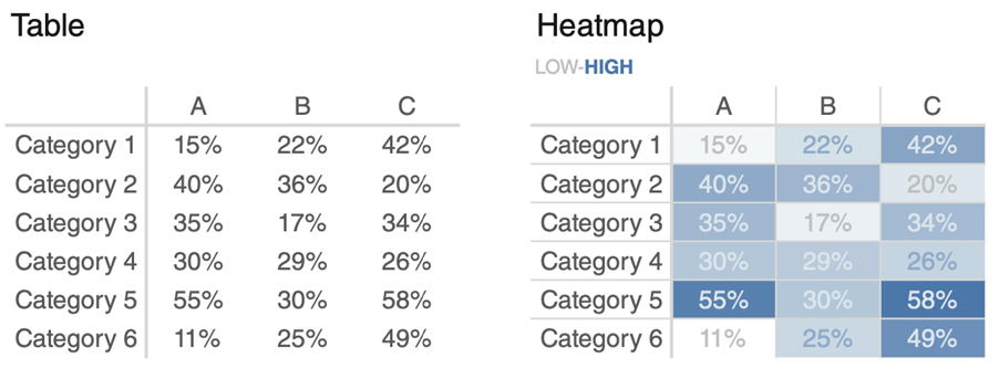
Heat map for visualising cluster analysis results. Row/x-axis is the product/service categories and column/y-axis is the cluster’s number/cluster’s name.
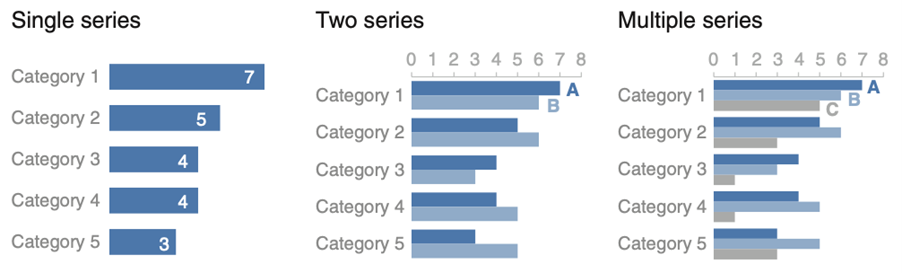
Bar chart for visualising the importance of different inflight services to customers. X-axis is the different inflight services and y-axis is the level of importance (rating from 1 to 5).
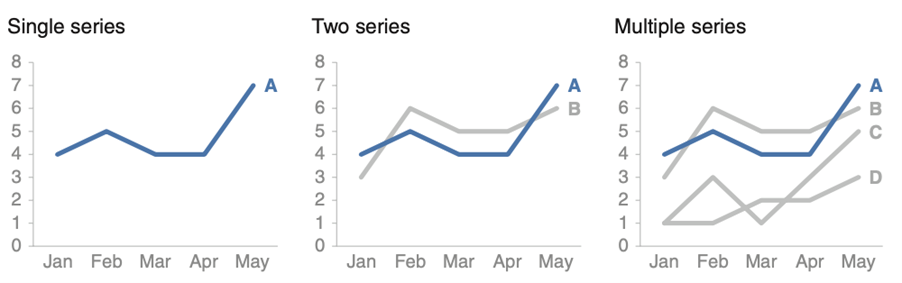
Line chart for visualising a retailer and its two competitors’ sales performances from 2015 to 2020. X-axis is the time (from 2015 to 2020) and y-axis is sales performance.